3 unique predictive back animations you can create with the navigation events library
Swipe to pop, drag to pop, and sticky shared element animations
TJ Dahunsi
Aug 27 2025 · 16 mins

Updated November 2nd, 2025 to match the APIs as of Navigation Event 1.0.0-beta01.
I recently wrote on the importance of persistent UI elements and how they convey a sense of placement in the app by convincingly anchoring key UI elements in place as a user navigates:
Navigation however, does not need to be atomic. Users don't always want to commit to navigation actions immediately, especially for navigation actions like going back where state is lost. Navigation instead can be progressive, offering a preview of the effect of the destructive navigation action. This is the rationale behind the predictive back design on Android, and where the new Jetpack navigation event library shines, giving precise control not only consuming navigation events, but for generating them too.
This blog post outlines 3 unique predictive back animations you can create with the navigation event library, visualized in the table below:
Slide to pop | Drag top Pop | Sticky Shared Elements |
|---|---|---|
|
|
|
For all animations, example code is shown in the context of the navigation 3 recipes repo, and full source is at the following pull request.
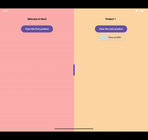
Slide to pop
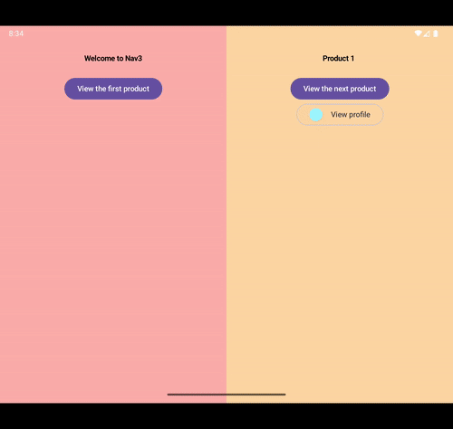
One of the most frequently occurring canonical layouts are feeds and list detail views. However, it is very common to have a feed layout transition to a list detail view when an item in the feed is clicked.
A feed transitioning to a list detail layout on larger screens |
|---|
|
When going back, a standard crossfade crossfade would work for the predictive back animation, but the "back" destination is already present and visible. A better animation may be to just simply expand the pane for the existing destination that remains, while shifting out the outgoing one. This can be done by making the pane widths completely dynamic and fully gesture driven at runtime with a few custom modifiers and navigation event driven state.
Gesture with the draggable Modifier
With the Navigation3 library, it's possible to render multiple NavigationEntry instances side by side, as seen in this TwoPaneSceneStrategy in the nav3-recipes repo, complete with an expanding pane predictive back transition. This is a fantastic place to start implementing custom animations. To make the layout more dynamic, we can use Modifier.Draggable to implement pane separators to resize either NavEntry.
The TwoPaneSceneStrategy already renders two entries side by side in a weighted row:
class TwoPaneScene<T : Any>(
    val firstEntry: NavEntry<T>,
    val secondEntry: NavEntry<T>
) : Scene<T> {
    override val content: @Composable (() -> Unit) = {
        Row(modifier = Modifier.fillMaxSize()) {
            Column(modifier = Modifier.weight(0.5f)) {
                firstEntry.Content()
            }
            Column(modifier = Modifier.weight(0.5f)) {
                secondEntry.Content()
            }
        }
    }
}
To change the width of the panes with a gesture, the weights of each wrapping Column will need to be dynamically adjusted as the gesture progresses. For this, I'll reach for a custom compose layout I've built that has the dynamic weight adjustment, but with no gesture handling: a SplitLayout. A SplitLayout is a Row (or Column) that allows for directly manipulating the weights of its children.
@Composable
fun SlideToPopLayout(
    ...,
    entries: List<NavEntry<*>>
) {
    val splitLayoutState = remember {
        SplitLayoutState(
            orientation = Orientation.Horizontal,
            maxCount = 2,
            minSize = 1.dp,
            visibleCount = {
                entries.size
            },
            keyAtIndex = { index ->
                entries[index].contentKey
            }
        )
    }

    SplitLayout(
        state = splitLayoutState,
        modifier = Modifier.fillMaxSize(),
        itemContent = { index ->
           Box(
                modifier = Modifier.constrainedSizePlacement(
                    orientation = Orientation.Horizontal,
                    minSize = splitLayoutState.size / 3,
                    atStart = index == 0,
                )
            ) {
                entries[index].Content()
            }
        },
    )
}
Next is the pane separator. A pane separator can be created using Modifier.draggable, and passing the drag deltas directly to the SplitLayoutState.dragBy(...) method. Internally, the SplitLayoutState will use the deltas to update the weight for each pane. This allows for drags on the pane separator to dynamically resize the panes.
@Composable fun SlideToPopLayout( ... ) { val density = LocalDensity.current val splitLayoutState = ... val draggableState = rememberDraggableState { splitLayoutState.dragBy( index = 0, delta = with(density) { it.toDp() } ) } SplitLayout( state = splitLayoutState, ... itemSeparators = { _, offset -> PaneSeparator( splitLayoutState = splitLayoutState, draggableState = draggableState, offset = offset, onBack = onBack, ) }, itemContent = { ... }, ) } @Composable private fun PaneSeparator( splitLayoutState: SplitLayoutState, draggableState: DraggableState, modifier: Modifier = Modifier, offset: Dp, onBack: () -> Unit, ) { val interactionSource = remember { MutableInteractionSource() } val isHovered by interactionSource.collectIsHoveredAsState() val isPressed by interactionSource.collectIsPressedAsState() val isDragged by interactionSource.collectIsDraggedAsState() val active = isHovered || isPressed || isDragged val width by animateDpAsState( label = "App Pane Draggable thumb", targetValue = if (active) DraggableDividerSizeDp else 8.dp ) val density = LocalDensity.current Box( modifier = modifier .offset { IntOffset( x = with(density) { (offset - (width / 2)).roundToPx() }, y = 0, ) } .width(width) .fillMaxHeight() ) { Box( modifier = Modifier .align(Alignment.Center) .fillMaxWidth() .height(DraggableDividerSizeDp) .draggable( state = draggableState, orientation = splitLayoutState.orientation, interactionSource = interactionSource, onDragStopped = { if (splitLayoutState.weightAt(0) > DragPopThreshold) onBack() } ) .background(MaterialTheme.colorScheme.primary, CircleShape) .hoverable(interactionSource) ) { if (active) Icon( modifier = Modifier .align(Alignment.Center), imageVector = Icons.Rounded.Code, contentDescription = null, tint = MaterialTheme.colorScheme.onPrimary, ) } } } private val PaneSeparatorTouchTargetWidthDp = 16.dp
Consume navigation events
The next step is to use:
The
NavigationBackHandlerto consume the back events sent by the system, and pass them to theNavigationEventDispatcherfor processing.The
NavigationEventDispatcherto observe back events generated by the user's gestures from the system.
The NavigationEventDispatcher exposes a transitionState field which is a StateFlow of NavigationEventTransitionState. It is a sealed class providing metadata about the back gesture, it can either be:
NavigationEventTransitionState.IdleNavigationEventTransitionState.InProgress
Both of these provide metadata about the progress of the gesture, and this progress value can then be used to dispatch raw deltas to the DraggableState based on the width of the first pane, and the total width of the layout.
The width of the first pane in the layout is calculated from the weight using the SplitLayoutState:
   val SplitLayoutState.firstPaneWidth
        get() = (weightAt(0) * size.value).roundToInt()
When the first
NavigationEventTransitionState.InProgressis received, the current width of the first pane is recorded.For all all othe navigation event transition states, the new width of the first pane is calculated using the progress in the metadata provided.
A
LaunchedEffectis used to observe changes to the desired pane width, and then drag theDraggableStateby those changes.
@Composable
private fun SlideToPopNavigationEventHandler(
    enabled: Boolean,
    splitLayoutState: SplitLayoutState,
    draggableState: DraggableState,
    onBack: () -> Unit,
) {
    val currentlyEnabled by rememberUpdatedState(enabled)
    var started by remember { mutableStateOf(false) }
    var widthAtStart by remember { mutableIntStateOf(0) }
    var desiredPaneWidth by remember { mutableFloatStateOf(0f) }

    NavigationBackHandler(
        state = rememberNavigationEventState(
            currentInfo = SecondaryPaneCloseNavigationEventInfo,
        ),
        isBackEnabled = currentlyEnabled,
        onBackCancelled = {
            started = false
        },
        onBackCompleted = {
            started = false
            onBack()
        },
    )

    val navigationEventDispatcher = LocalNavigationEventDispatcherOwner.current!!
        .navigationEventDispatcher

    LaunchedEffect(navigationEventDispatcher) {
        var wasIdle = true
        navigationEventDispatcher
            .transitionState
            .collect { state ->
                when (state) {
                    NavigationEventTransitionState.Idle -> wasIdle = true
                    is NavigationEventTransitionState.InProgress -> if (currentlyEnabled) {
                        if (wasIdle) {
                            widthAtStart = splitLayoutState.firstPaneWidth
                            started = true
                        }
                        val progress = state.latestEvent.progress
                        val distanceToCover = splitLayoutState.size.value - widthAtStart
                        desiredPaneWidth = (progress * distanceToCover) + widthAtStart
                        wasIdle = false
                    }
                }
            }
    }
Put it together
With the above, the SlideToPopLayout becomes:
@Composable
fun SlideToPopLayout(
    isCurrentScene: Boolean,
    onBack: () -> Unit,
    entries: List<NavEntry<*>>
) {
    val splitLayoutState = remember {
        SplitLayoutState(...)
    }
    val draggableState = rememberDraggableState {
        splitLayoutState.dragBy(...)
    }
    SplitLayout(
        state = splitLayoutState,
        modifier = Modifier.fillMaxSize(),
        itemSeparators = { _, offset ->
            PaneSeparator(...)
        },
        itemContent = { ... },
    )

    if (isCurrentScene) {
        SlideToPopNavigationEventHandler(
            enabled = (entries.lastOrNull()?.metadata?.containsKey(TwoPaneScene.TWO_PANE_KEY) == true),
            splitLayoutState = splitLayoutState,
            draggableState = draggableState,
            onBack = onBack,
        )
    }
}
Shared element slide to pop | Gesture driven slide to pop |
|---|---|
|
|

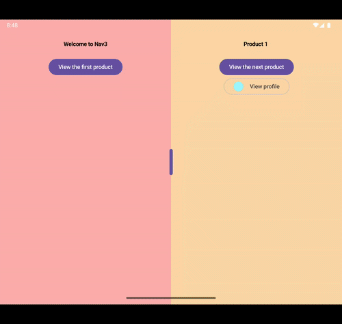
Drag to pop
There are two sides to the navigation event API; the consumer side, and the producer side. So far, only the consumer side has been explored. On the producer side, there's a NavigationEventInput which allows you to send navigation events to the NavigationEventDispatcher. This allows for converting regular UI gestures into navigation events. A classic use case for this is a drag to dismiss gesture.
Gesture with the draggable2D Modifier
Similar to the previous animation, drag to dismiss also requires drag gestures, but along two axes instead of just one. So instead of using Modifier.draggable, this gesture uses Modifier.draggable2D.
Creating a drag to dismiss Modifier is fairly straightforward. First we start with a DragToDismissState for managing a generic drag to dismiss gesture:
@Stable
class DragToDismissState(
    internal val coroutineScope: CoroutineScope,
    enabled: Boolean = true,
    animationSpec: AnimationSpec<Offset> = DefaultDragToDismissSpring
) {
    var enabled by mutableStateOf(enabled)
    var animationSpec by mutableStateOf(animationSpec)
    var offset by mutableStateOf(Offset.Zero)
        internal set
    internal val draggable2DState = Draggable2DState { dragAmount ->
        offset += dragAmount
    }
    internal var startDragImmediately by mutableStateOf(false)
}
Next, this state can be combined with Modifier.draggable2D to create a higher order Modifier; Modifier.dragToDismiss. The Modifier will need to report 3 main events:
Drag start.
Drag progress.
Drag end or cancel. Where a cancellation is a drag that stopped without reaching the dismissal threshold.
This can be achieved with a Modifier with the following signature:
fun Modifier.dragToDismiss(
    state: DragToDismissState,
    shouldDismiss: (Offset, Velocity) -> Boolean,
    onStart: () -> Unit = {},
    onCancelled: (reset: Boolean) -> Unit = {},
    onDismissed: () -> Unit,
): Modifier = draggable2D(
    state = state.draggable2DState,
    startDragImmediately = state.startDragImmediately,
    enabled = state.enabled,
    onDragStarted = {
        onStart()
    },
    onDragStopped = { velocity ->
        if (shouldDismiss(state.offset, velocity)) {
            onDismissed()
            state.offset = Offset.Zero
        } else {
            onCancelled(false)
            // animate resetting the dragged item back to its original position
            ...
            onCancelled(true)
        }
    }
)
The full source of the Modifier has been omitted for brevity, but can be seen in at the link below:
Link.
This modifier can then be built upon for a Modifier.dragToPop() that has access to the app's navigation state.
Produce navigation events
Integrating the above with navigation events requires yet another higher order Modifier, Modifier.dragToPop(). This is because access to the composition is needed for the following:
The current
NavigationEventDispatcherOwner.Launching an effect for creating a snapshotFlow for drag offset changes.
This particular modifier:
Delegates to the just defined
Modifier.dragToDismiss()that does not have aModifier.Nodeimplementation.Needs access to a
CoroutineScopeand Composition locals.
A pattern I like to follow for these kinds of modifiers, is to:
Use a UI logic state holder with a private constructor. The constructor has arguments that are retrieved from the Composition.
Create a Companion object for the state holder that:
Has a public
rememberStateHolderComposable function: This fishes out variables needed from the Composition, and passes them to the private constructor of the state holder.Holds the actual
Modifierfunction: This allows theModifierto read private fields in the state holder that are gotten from the Composition.
First, the DragToPopState. It has:
A
Channelfor creating aFlowofNavigationEventStatus, a sealed class hierarchy describing the status of the back gesture.A suspending function
awaitEvents()for using theDirectNavigationEventInputto dispatch aNavigationEventwhen the drag offset changes.Flow.collectLatest()is used because it is very important that theDirectNavigationEventInputsends inputs in the correct order.
@Stable
class DragToPopState private constructor(
    private val dismissThresholdSquared: Float,
    private val dragToDismissState: DragToDismissState,
    private val input: DirectNavigationEventInput,
) {

    private val channel = Channel<NavigationEventStatus>()
    private var dismissOffset by mutableStateOf<IntOffset?>(null)

    suspend fun awaitEvents() {
        channel.consumeAsFlow()
            .collectLatest { status ->
                when (status) {
                    NavigationEventStatus.Completed.Cancelled -> {
                        input.backCancelled()
                    }

                    NavigationEventStatus.Completed.Commited -> {
                        input.backCompleted()
                    }

                    NavigationEventStatus.Seeking -> {
                        input.backStarted(dragToDismissState.navigationEvent(progress = 0f))

                        snapshotFlow(dragToDismissState::offset).collectLatest {
                            input.backProgressed(
                                dragToDismissState.navigationEvent(
                                    min(
                                        a = dragToDismissState.offset.getDistanceSquared() / dismissThresholdSquared,
                                        b = 1f,
                                    )
                                )
                            )
                        }
                    }
                }
            }
    }

    companion object {
        ...
    }
}

sealed class NavigationEventStatus {
    data object Seeking : NavigationEventStatus()
    sealed class Completed : NavigationEventStatus() {
        data object Commited : Completed()
        data object Cancelled : Completed()
    }
}

private fun DragToDismissState.navigationEvent(
    progress: Float
) = NavigationEvent(
    touchX = offset.x,
    touchY = offset.y,
    progress = progress,
    swipeEdge = NavigationEvent.EDGE_LEFT,
)
Next, is rememberDragToPopState, which fishes things out of the Composition like the density to calculate the dismissal threshold, and properly sets up the DirectNavigationInput:
@Stable
class DragToPopState private constructor(
    ...
) {
    ...
    companion object {
        @Composable
        fun rememberDragToPopState(
            dismissThreshold: Dp = 200.dp
        ): DragToPopState {

            val floatDismissThreshold = with(LocalDensity.current) {
                dismissThreshold.toPx().let { it * it }
            }

            val dragToDismissState = rememberUpdatedDragToDismissState()

            val dispatcher = checkNotNull(
                LocalNavigationEventDispatcherOwner.current
                    ?.navigationEventDispatcher
            )
            val input = remember(dispatcher) {
                DirectNavigationEventInput()
            }

            DisposableEffect(dispatcher) {
                dispatcher.addInput(input)
                onDispose {
                    dispatcher.removeInput(input)
                }
            }

            val dragToPopState = remember(dragToDismissState, input) {
                DragToPopState(
                    dismissThresholdSquared = floatDismissThreshold,
                    dragToDismissState = dragToDismissState,
                    input = input
                )
            }

            LaunchedEffect(dragToPopState) {
                dragToPopState.awaitEvents()
            }

            return dragToPopState
        }
    }
}
Finally, the Modifier is defined, which does not need access to the Composition; just its state holder.
@Stable
class DragToPopState private constructor(
    ...
) {
    ...
    companion object {
        fun Modifier.dragToPop(
            dragToPopState: DragToPopState,
        ): Modifier = dragToDismiss(
            state = dragToPopState.dragToDismissState,
            shouldDismiss = { offset, _ ->
                offset.getDistanceSquared() > dragToPopState.dismissThresholdSquared
            },
            // Enable back preview
            onStart = {
                dragToPopState.channel.trySend(NavigationEventStatus.Seeking)
            },
            onCancelled = cancelled@{ hasResetOffset ->
                if (hasResetOffset) return@cancelled
                dragToPopState.channel.trySend(NavigationEventStatus.Completed.Cancelled)
            },
            onDismissed = {
                dragToPopState.dismissOffset = dragToPopState.dragToDismissState.offset.round()
                dragToPopState.channel.trySend(NavigationEventStatus.Completed.Commited)
            }
        )
            .offset {
                dragToPopState.dismissOffset ?: dragToPopState.dragToDismissState.offset.round()
            }
    }
}
Put it together
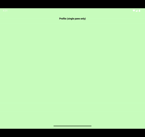
Use of the Modifier is like any Modifier; in the lambda for the Profile NavEntry, its content Composable invokes Modifier.dragToPop().
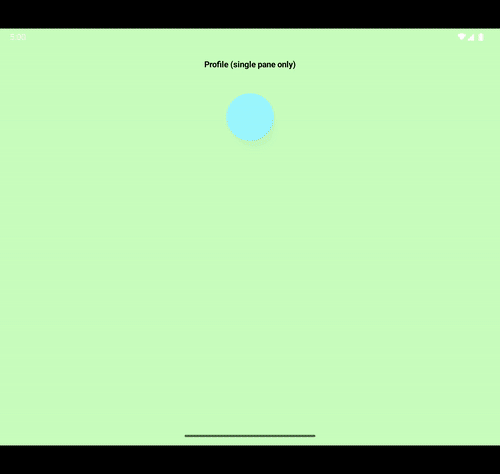
entry<Profile> { profile ->
    ContentGreen(
        title = "Profile (single pane only)",
        modifier = Modifier
            .dragToPop(rememberDragToPopState())
    )
}
Predictive back pop | Drag to pop |
|---|---|
|
|
Sticky shared element back previews
This last example is the most complex, as it requires a fair amount of book keeping that is typically the first sign that your app may want to create its own custom NavDisplay with the standard NavDisplay as a delegate. Let's start by outlining the problem.
Control the shared element Modifier
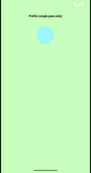
Typically, use of Modifier.sharedElement takes in an AnimatedVisibilityScope as a parameter. This, in combination with the Transition used in the NavDisplay means that by default, shared element transitions between navigation destinations are seekable. Adding a circle for the profile's avatar illustrates this:
Non sticky shared element |
|---|
|
However, this can be an undesired effect. When going back from screens where media is the focus, a "sticky shared element" is often desired, where the shared element adheres onto the outgoing screen until the back gesture is fully committed.
To create a sticky shared element Modifier, we need absolute control of when the shared element transition is triggered, and Compose has an API specifically for this: Modifier.sharedElementWithCallerManagedVisibility. With this API, instead of passing an AnimatedVisibilityScope to manage the transition, a visible flag is passed, and changes to it trigger a shared element transition. The next step therefore is knowing exactly when to trigger the transition.
Observe navigation event state
In the two examples above, the snippets were active consumers or producers of navigation events. This example however, requires a much more passive approach. Instead of registering a NavigationEventHandler, or using a NavigationEventInput, StateFlow fields on the NavigationEventDispatcher will instead be collected from to introspect, with frame precision, the status of the the navigation events.
The passively observed state will be tightly synchronized with the current NavEntry shown, as well as the Transition running in the NavDisplay by:
Creating a custom scene key that encodes the exact state of the backstack it was created for. This is because even after the predictive back gesture has been cancelled, the
NavDisplayanimates into a settled position instead of stopping its transition abruptly.Tracking the status of the back gesture. It can be one of:
In progress: Its ongoing
Cancelled: It was cancelled.
Committed: It was fully committed and the app went back.
Combining the information from the two steps above in a UI logic state holder to produce a
Booleanvalue for whether or not the shared element is visible.Using the
Modifier.sharedElementWithCallerManagedVisibilitywith theBooleanvalue from the previous step.
Identify scenes
Since the custom scene key needs to uniquely identify a backstack, a list of the content keys of each NavEntry in the back stack is used to identify it:
data class TwoPaneSceneKey(
    val contentKeys: List<Any>,
)
With this custom scene key, it becomes possible to identify what scenes the backing Transition in the NavDisplay is animating between:
private val Transition<*>.sceneTargetDestinationKey: TwoPaneSceneKey
    get() {
        val target = parentTransition?.targetState as Scene<*>
        return target.key as TwoPaneSceneKey
    }

private val Transition<*>.sceneCurrentDestinationKey: TwoPaneSceneKey
    get() {
        val target = parentTransition?.currentState as Scene<*>
        return target.key as TwoPaneSceneKey
    }
Track navigation event status
Next, is determining the current status of the predictive back gesture which can be done by evaluating two StateFlow instances provided by the NavigationEventDispatcher:
NavigationEventDispatcher.transitionState: This was previously used for the drag to pop gesture, it provides metadata about the progress of the back gesture.NavigationEventDispatcher.history: This field provides information about the destination being popped back to. It is needed to:Passively check if the back gesture was actually completed or cancelled, without explictly registering a
NavigationEventHandlerthat produces back events.Make sure the
NavigationEventHandlerproducing the events is theNavDisplayitself, and not anotherNavigationEventHandler.
The use of both is shown below:
@Composable
fun rememberNavigationEventStatus(): State<NavigationEventStatus> {
    val navigationEventDispatcher = LocalNavigationEventDispatcherOwner.current!!
        .navigationEventDispatcher

    val lastSceneKey = remember {
        mutableStateOf<Any?>(null)
    }
    val navigationEventStatusState = remember {
        mutableStateOf<NavigationEventStatus>(NavigationEventStatus.Completed.Commited)
    }

    LaunchedEffect(navigationEventDispatcher) {
        navigationEventDispatcher.history.collect { history ->
            history.currentSceneKey?.let(lastSceneKey::value::set)
        }
    }

    LaunchedEffect(navigationEventDispatcher) {
        navigationEventDispatcher.transitionState.collect { transitionState ->
            navigationEventStatusState.value = when (transitionState) {
                NavigationEventTransitionState.Idle -> when (lastSceneKey.value) {
                    navigationEventDispatcher.history.value.currentSceneKey -> NavigationEventStatus.Completed.Cancelled
                    else -> NavigationEventStatus.Completed.Commited
                }

                is NavigationEventTransitionState.InProgress -> NavigationEventStatus.Seeking
            }
        }
    }
    return navigationEventStatusState
}

private val NavigationEventHistory.currentSceneKey
    get() = when (val navigationEventInfo = mergedHistory.getOrNull(currentIndex)) {
        is SceneInfo<*> -> navigationEventInfo.scene.key
        else -> null
    }
Manage sticky shared element state
Finally, the state holder for managing the visibility of the sticky shared element can be created. In a production app, this most likely will be the ScaffoldState covered in the following article:
Link.
For this example, the following suffices:
@Composable
fun rememberStickyAnimatedVisibilityScope(): StickyAnimatedVisibilityScope {
    val navigationEventStatusState = rememberNavigationEventStatus()
    val animatedContentScope = LocalNavAnimatedContentScope.current

    return remember(navigationEventStatusState, animatedContentScope) {
        StickyAnimatedVisibilityScope(
            backStatus = navigationEventStatusState::value,
            animatedContentScope = animatedContentScope,
        )
    }
}

class StickyAnimatedVisibilityScope(
    val backStatus: () -> NavigationEventStatus,
    animatedContentScope: AnimatedContentScope,
) : AnimatedVisibilityScope by animatedContentScope {

    val isStickySharedElementVisible: Boolean
        get() = if (isShowingBackContent) !isEntering else isEntering

    private val isEntering
        get() = transition.targetState == EnterExitState.Visible

    private val isShowingBackContent: Boolean
        get() {
            val currentSize = transition.sceneCurrentDestinationKey?.contentKeys?.size ?: 0
            val targetSize = transition.sceneTargetDestinationKey?.contentKeys?.size ?: 0

            val animationIsSettling = targetSize < currentSize

            return when (backStatus()) {
                NavigationEventStatus.Seeking -> animationIsSettling
                NavigationEventStatus.Completed.Cancelled -> animationIsSettling
                NavigationEventStatus.Completed.Commited -> false
            }
        }

}
Put it together
There has been quite a bit of work done so far, and unfortunately, it comes with a few caveats:
While the sticky shared element is in fact sticky, it is exempt from ALL transitions being run in the scene. This means that any transitions specified in the
NavDisplaywill simply not affect it. Scale animations will need to be done manually in layout with aModifier.The sticky shared element has a bit of a jelly effect when translated as the backing
ApproachlayoutModifierNodefor the sticky shared elementModifierimplicitly runs approach animations as theNavEntrylayout is displaced.
To work around this, the default predictivePopTransitionSpec in the NavDisplay for the profile NavEntry is removed. Instead, the its NavEntry is wrapped with a Box, and Modifier.fillMaxSize() with a fraction derived from the navigation event's progress is used for the scale down animation.
entry<Profile>(
    metadata = NavDisplay.predictivePopTransitionSpec {
        // Update the pop back transition spec, the default scale
        // down will run on everything but the sticky shared element
        EnterTransition.None togetherWith fadeOut(targetAlpha = 0.8f)
    }
) { profile ->
    val stickyAnimatedVisibilityScope =
        rememberStickyAnimatedVisibilityScope()

    val scale = LocalNavigationEventDispatcherOwner.current!!
        .navigationEventDispatcher
        .transitionState
        .map(NavigationEventTransitionState::predictiveBackScale)
        .collectAsState(1f)

    ContentGreen(
        title = "Profile (single pane only)",
        modifier = Modifier
            .fillMaxSize(fraction = scale.value)
            .dragToPop(rememberDragToPopState())
    ) {
        val profileColor = Color.fromColorLong(profile.colorLong)
        Box(
            modifier = Modifier
                .statusBarsPadding()
                .padding(vertical = 16.dp)
                .sharedElementWithCallerManagedVisibility(
                    sharedContentState = rememberSharedContentState(
                        profileColor
                    ),
                    visible = stickyAnimatedVisibilityScope.isStickySharedElementVisible,
                )
                .background(
                    color = profileColor,
                    shape = CircleShape,
                )
                .size(80.dp)
        )
    }
}


private fun NavigationEventTransitionState.predictiveBackScale() = when (this) {
    NavigationEventTransitionState.Idle -> 1f
    is NavigationEventTransitionState.InProgress -> max(
        1f - latestEvent.progress,
        0.7f
    )
}
The impact of this shown in the table below. Notice how the default predictivePopTransitionSpec scales down the text in the second screen recording, but leaves the sticky shared element the same size. In the third recording, a manual layout scale animation, the parent layout is scaled down, but all elements inside it keep their original size.
Default seeking shared element | Sticky shared element with default predictivePopTransitionSpec | Sticky Shared Element with manual layout scale |
|---|---|---|
|
|
|
Ultimately, with the current version of Jetpack Compose, it comes down to what motion artifacts you can tolerate with shared elements when doing a predictive back animation.
Wrap up
The navigation events library is a crucial tool for introspecting gesture driven navigation state by helping disambiguate the nuance of events and state with respect to navigation. While the Navigation 3 library provides APIs for treating navigation as state, the navigation events library complements it by providing enough information to create frame perfect animations in tight coordination with the navigation state and general application state.
Its API offers specific and semantic APIs for the observers, producers and even consumers of app navigation metadata, allowing for mixing and matching them to meet your application's needs.
Loading comments...