Material is the metaphor: pushing the limits of building with Material design cross platform with Jetpack Compose
Adopting glass as the material with material design

TJ Dahunsi
Oct 14 2026 · 9 mins

Designing your app for a platform is an interesting tightrope walk. Each platform has its own aesthetics and visual cues, and adhering too much to the platform's stock UI runs the risk of making your app look cookie-cutter. It blends into the sea of other apps on the user's device and becomes forgettable.
Then there's your brand. A good brand identity is visually distinct regardless of the context it's placed in. Heron initially started out as a full on material design app, wholly inspired by the Material Design 2 Crane study. With time, it's grown into my creative outlet for app architecture and design, leading to a few open source libraries and lots of opinions on what it means to build an app that feels pleasant to use.
The rest of this article details the challenges and decisions in adopting material design as the base design system on the Heron Android and iOS apps using Compose multiplatform, as well as the technical challenges overcome to get there. This is particularly salient in a world where AI agents are more than capable of creating the same app twice using each platform's native frameworks as Shopify recently announced.
Convergent Design
I love design. I think design is one of the ultimate forms of systems engineering where the constraints are a little more fun to work with. Budgets are measured in frames per second, not dollars… at least to a certain degree. Metrics exist that put lost dollars to poor app performance, however that's not in focus for an app that's a creative outlet. Anyway, it's interesting that Twitter, Bluesky and Threads have all coalesced into what I can only describe as the standard micro-blogging app design, sharing a general (perhaps generic?) look for timelines, app bars, navigation and app iconography:
Twitter timeline | Bluesky timeline | Threads timeline |
|---|---|---|
|
|
|



To borrow an increasingly common phrase from our times, it would appear designing for micro-blogging is solved.
Material is the metaphor
Being a sole individual with no UX researchers or designers to caution against my whims, I felt I could take a little more risk. I started with adjectives that I wanted users to associate with my app: graceful, smooth, elegant. This turned out to be a durable, yet malleable motif that would permeate all through Heron.
To carry this motif in the context of material design, I chose glass as the material because contemporary designs across platforms have some degree of glassiness. To give myself some flexibility, especially given the constraints of building with Compose multiplatform, Heron has 3 kinds of glass, for 3 distinct app layers:
Matte glass: An opaque, shimmerless, matted glass for most of the app's surface and content. It's the lowest layer.
Satin glass: A semi translucent glass that behaves identically across platforms. It's used for app bar UI Chrome, headers, and is the middle layer.
Float glass: A platform specific glass that houses navigation UI chrome and the floating action button. It's also the highest elevation surface in the app. Float is apt here as float glass does exist, doesn't have to be transparent, and lends itself well to metaphor as it floats over other UI elements.
The wireframes below help illustrate this. Matte timeline items fill the entirety of the screen, with the satin glass category tabs header partially obscuring content at the top. Navigation bars round out the trio floating above everything else at the bottom.
Android Wireframes | iOS Wireframes |
|---|---|
|
|
|
|
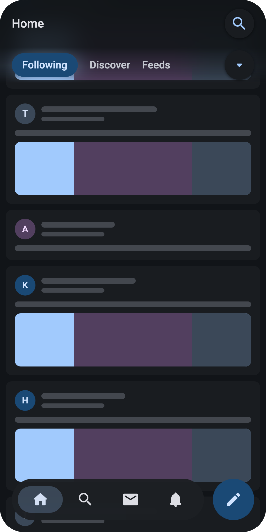
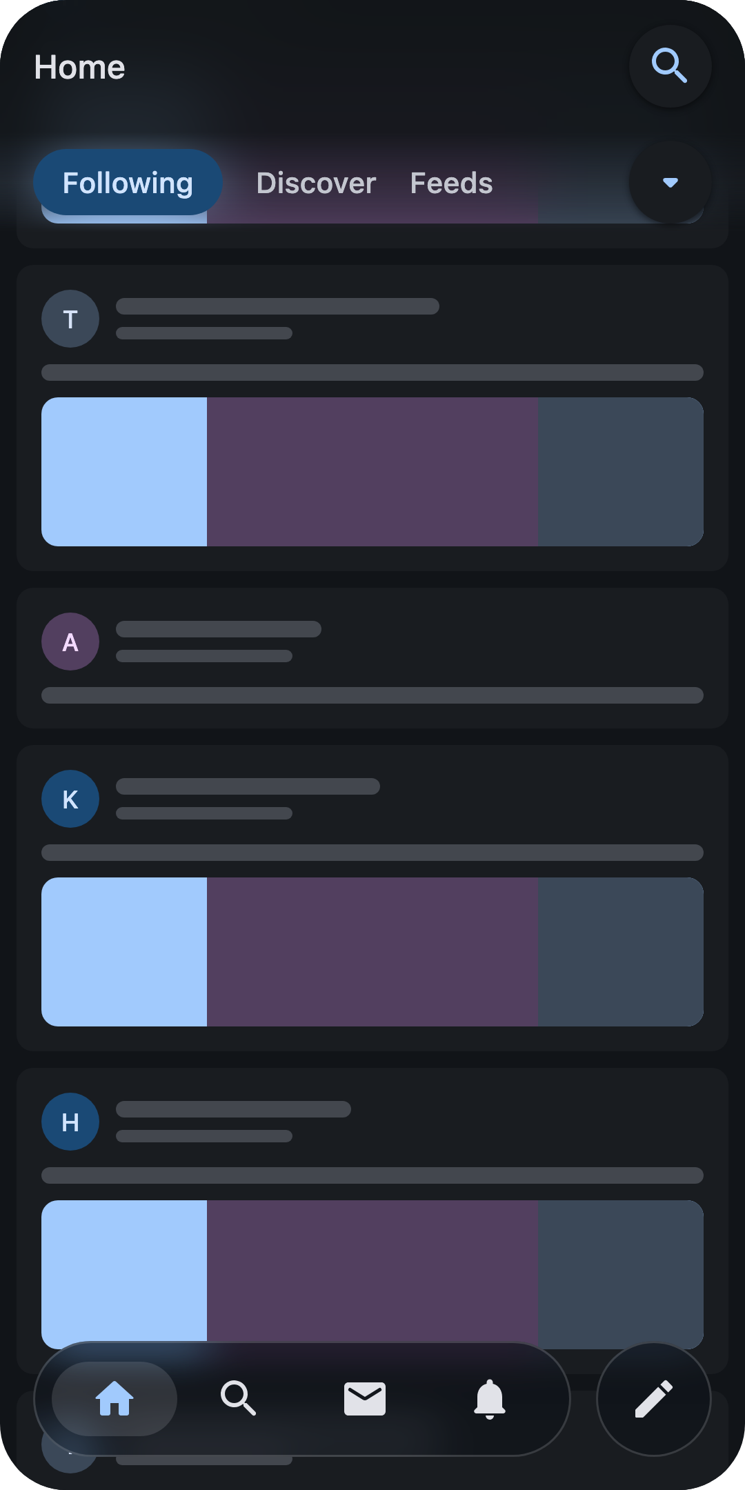
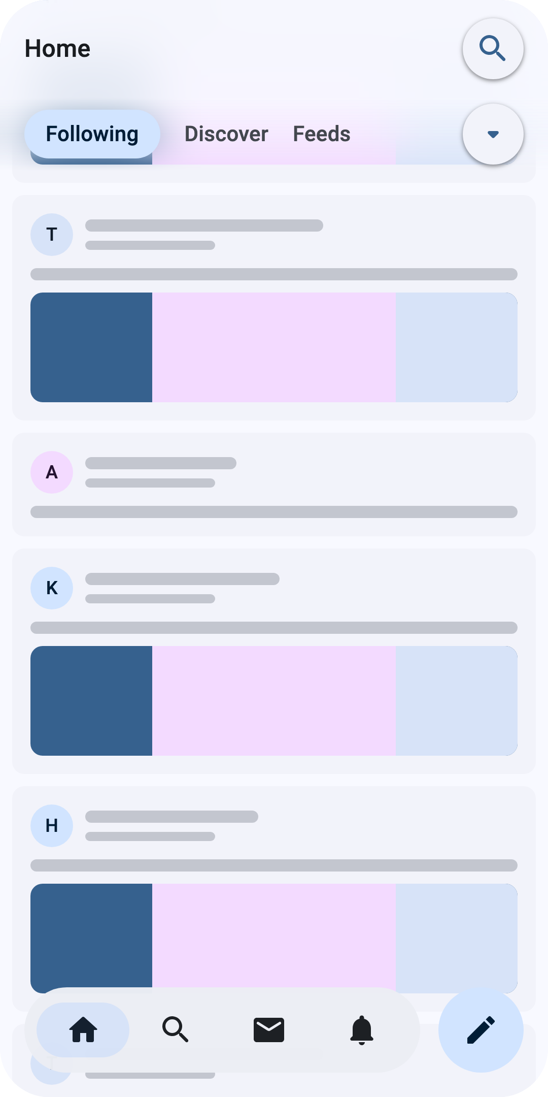
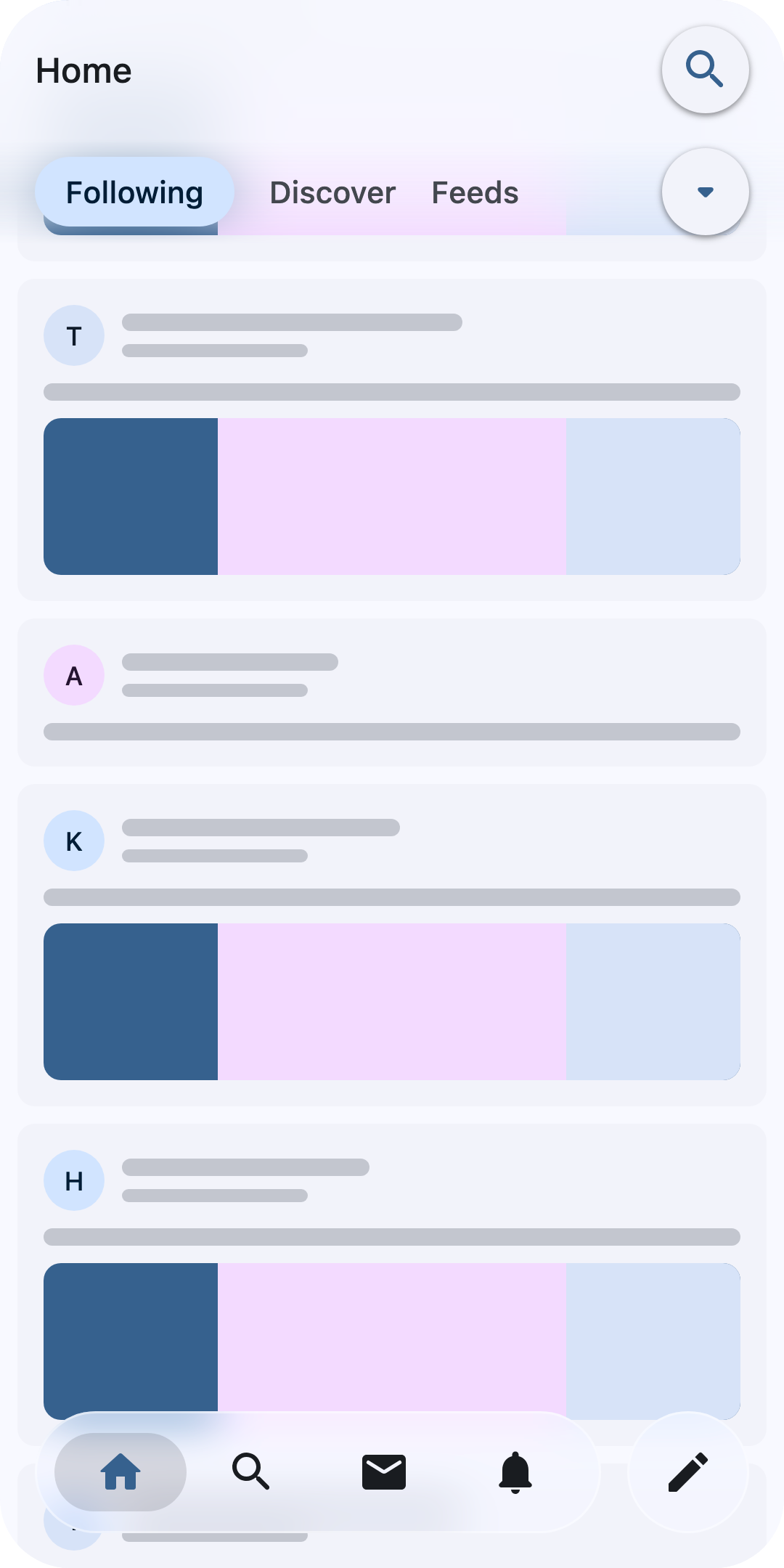
Wireframes of Heron's materials.
Matte glass on the Timeline
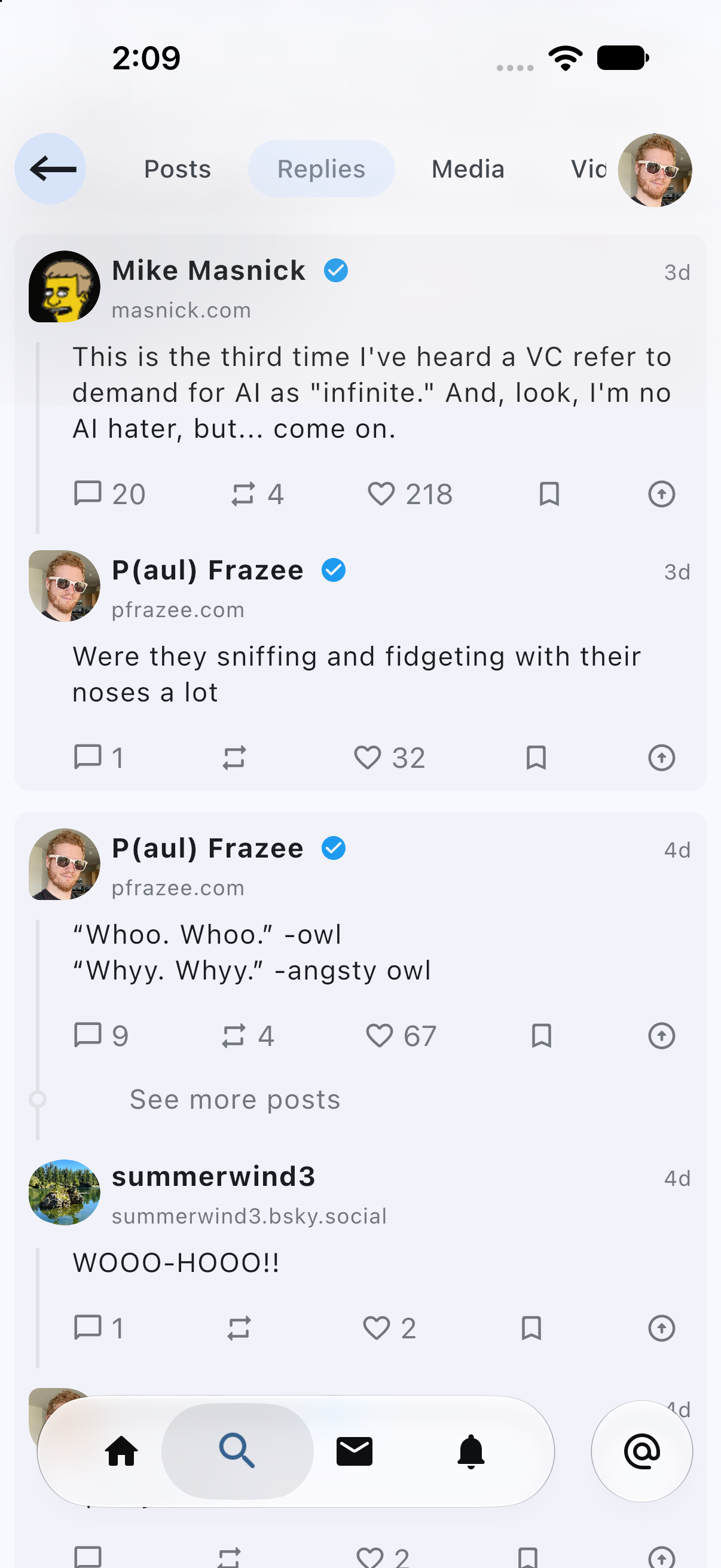
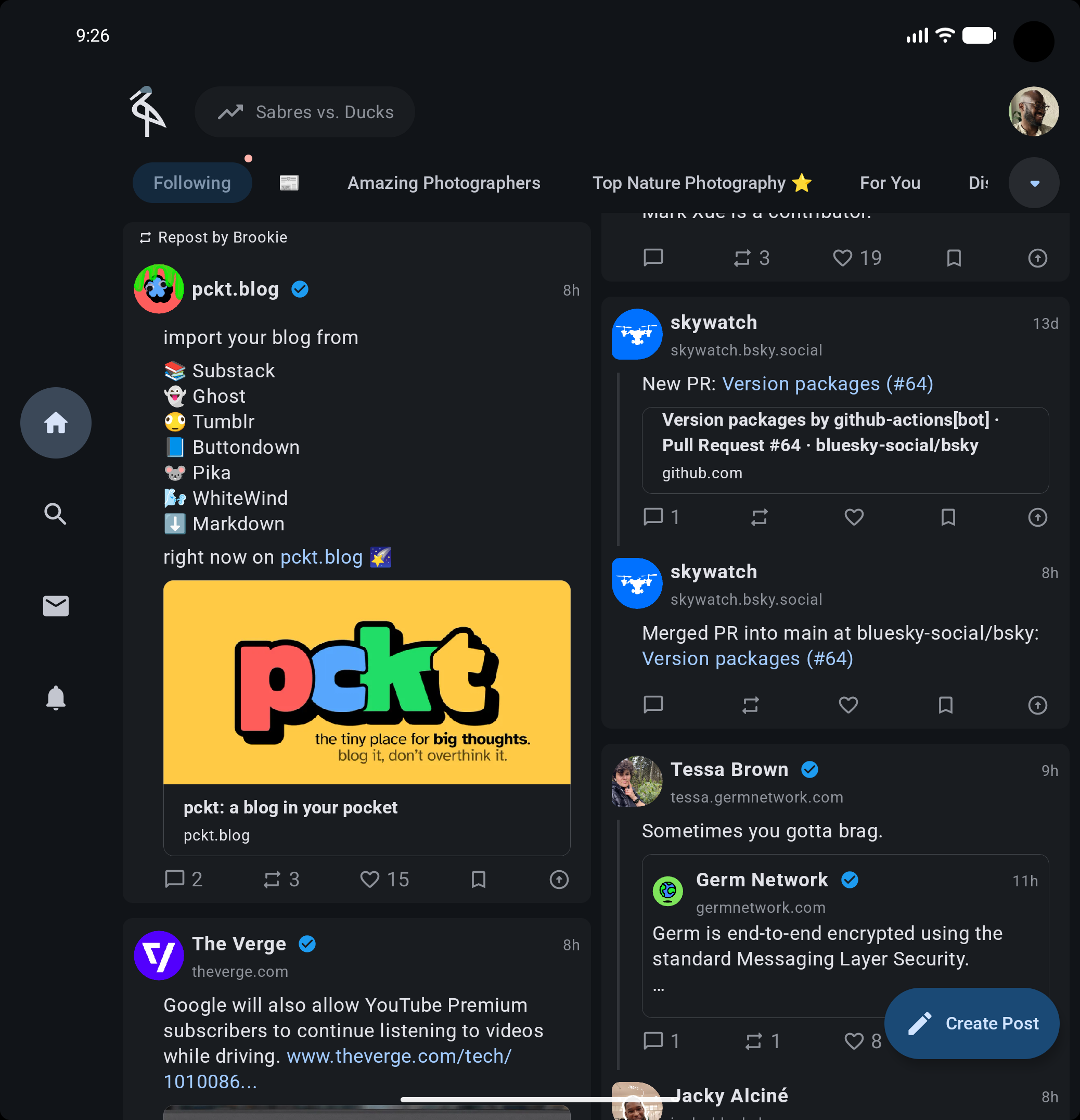
Timeline items sit on pieces of matte glass, implemented with material cards. This is a fine approximation as it gives the desired look of Heron's matte glass out of the box. This contrasts with contemporary apps who all elect for flat lists for displaying timeline content. I decided against flat lists because it limits timelines to being exactly that; lists. On devices where the timeline has enough room to be displayed in a grid, the list becomes a self imposed constraint. Heron is designed to be adaptive first, and matte glass for timeline items provides both form and function.
Things get a little more interesting with profile avatars. There, I opted for a gravity warping timeline metaphor. Replies to posts have lines that warp a poster's avatar, pulling it towards the line as if the line had mass; timeline dilation if you will. This allowed me to escape the same start indentation for the text common across the three microblogging apps for avatars; Heron instead lets some text be under the avatar.
Matte glass on the timeline on an iPhone 18 in light mode | Matte glass on the timeline on a Pixel 10 Pro Fold in dark mode |
|---|---|
|
|
Satin glass on headers and app bars
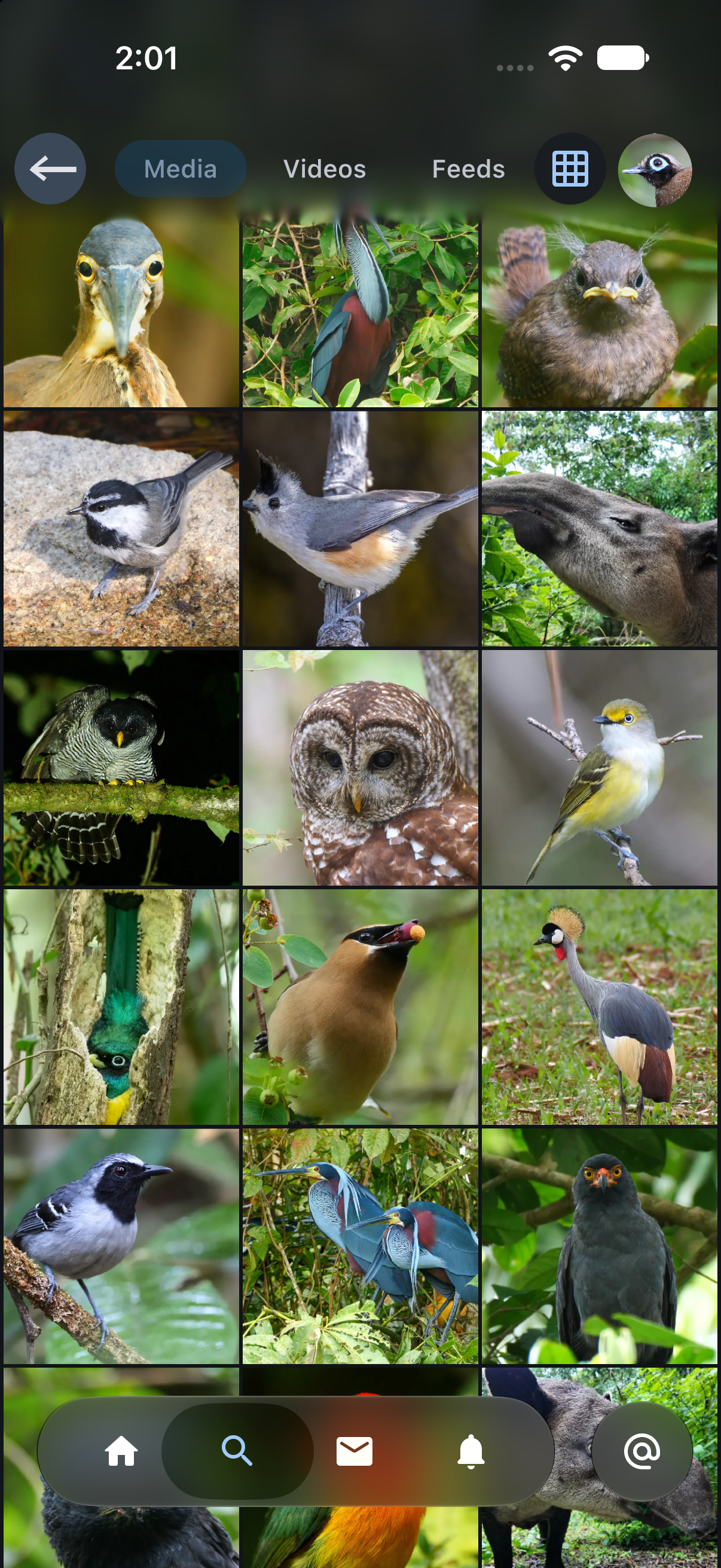
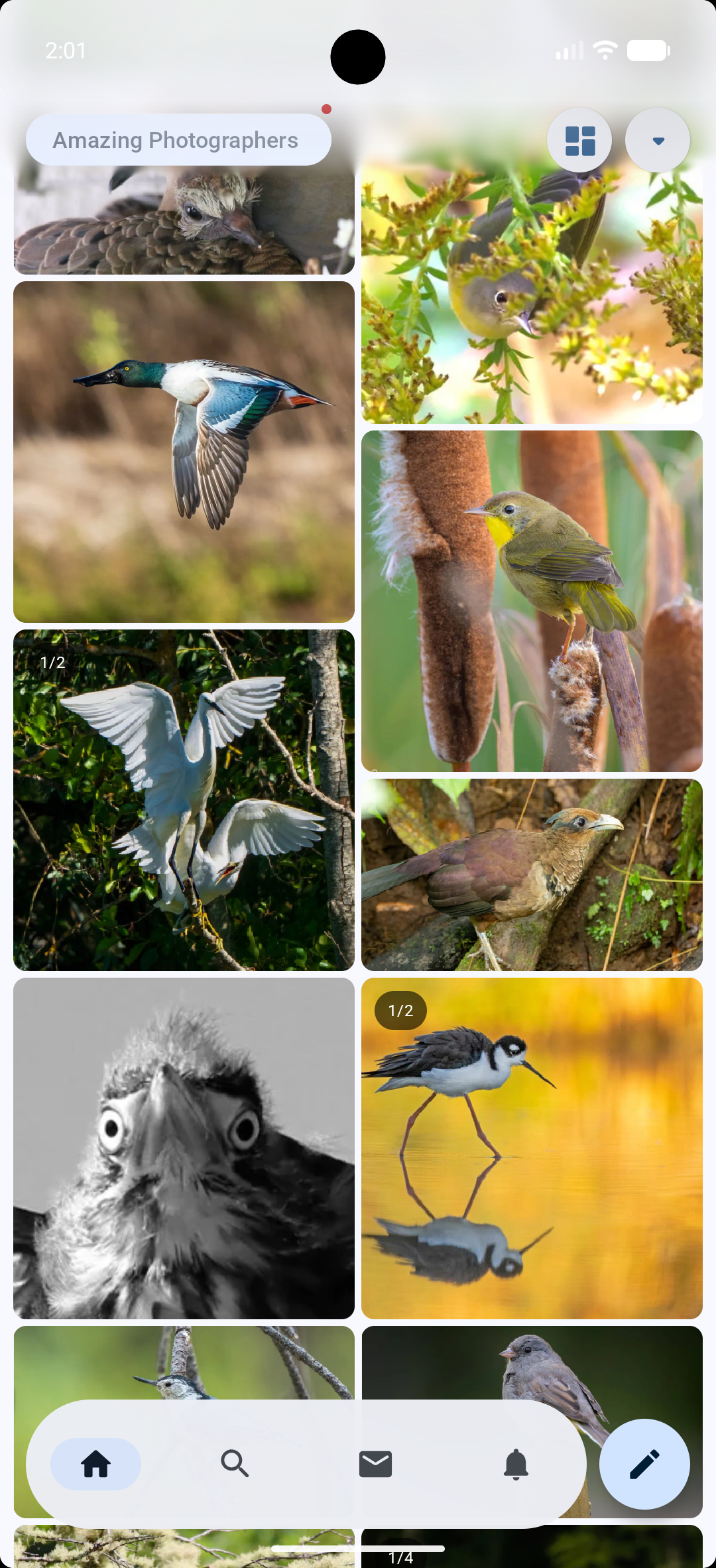
Moving a level up, we have the first glass material that's part of general UI chrome: satin. Satin glass is used for headers and app bars, and matte glass content along with most else, scrolls underneath it.
This glass finds itself in the most challenging rendering environments, as Heron supports UI patterns around headers and appbars like the quick return pattern, collapsing headers, and so on. As a result, this glass is rendered entirely by Heron in Compose using quite a bit of guile. This allows for consistency across platforms that is truly Heron's to define.
Satin glass in the header on profile media on an iphone 18 in dark mode | Satin glass in the header on media in a custom feed on the home screen on a Pixel 10 in light mode |
|---|---|
|
|
Float on Navigation
Navigation as an app function is in rarified air and there are fewer things more key. On both Android and iOS, these elements hover, and don't really interfere with anything else, giving the most flexibility in their implementation. As you may have surmised from previous screenshots, it's also where platforms are most opinionated about what navigation UI elements look like, so rather than define a material unique to Heron, I simply just use the platform's native components to make the app feel native, while other parts of the app are Heron's.
The entirety of Heron looking and feeling like a native app hinges on this. Users on iOS can adjust liquid glass transparency in settings, and Heron picks it up. Material design could rethink its bottom navigation for the next iteration, and it'll float just fine in Heron like the previous version did. I keep full control of my brand, and pay my platform tax by ceding the design of the most often used UI element in the app to it.
Liquid glass on iOS as float glass in Heron |
|---|
Crafting materials
The above shows the materials, but bringing them to life required virtually every trick I know about building UI from the esoteric to just downright being crafty.
Timeline Dilation
As previously mentioned, the matte glass the timeline items rest on are simple cards. The real fun was in the timeline distorted avatar shapes. Prior to last week, I used the androidx shapes library to draw the avatar shape outlines, before converting them to the Compose Shape primitive. As of Compose 1.13.0-beta01 however, Compose foundation added the PolygonShape primitive, and I was able to migrate and remove my custom morphing code in a single PR.
Shared Elements
These shapes are stateful, and morph during shared element transitions to the profile screen from their distorted forms to circles.
Feathering Satin
Satin glass was by far the most challenging to implement. The effect I was going for was a glass header over the content below. Chris has a fantastic blog post explaining exactly why this is so difficult on Android, much less porting the behavior to iOS. That said, design is systems engineering so all I had to do was define my satin glass capabilities to be within the constraints of the Compose API.
The interpretation of the constraint meant satin glass is to only be used for headers; it must start from the top of the content to an arbitrary height and radius. This is because satin glass is really just the progressive blur API on android, or a Skia port for iOS, along with a dark scrim applied to the scrollable content it's supposed to cover, but with snapshot state aware lambdas to dynamically change the blur radius and height. This allows the blur to be defined as a function of scroll position, and make it appear like it's the header blurring content beneath it.
Shared Elements
Given the hoops I had to jump through above, why not just use Haze? Afterall, the problem space has already been mapped and a well tested solution exists. The answer would once again be Compose's shared element semantics.
When a shared element transition is ongoing, the shared element is rendered in an overlay, above all other content. In the case of Haze and my custom solution, that means there is no content to actually blur during the transition, so when the transition completes and the element was occluded by the glass, it would appear to just pop in. There is no solution to this, it can only be masked. So when a shared element transition runs:
On forward navigation, do nothing special the pop is negligible.
On back navigation:
If the shared element is occluded by the satin glass, only draw its scrim during the transition. After the transition completes, gently feather in the content blur over 800 ms so the pop isn't distracting.
If the content isn't obscured by the glass, proceed as normal as the glass illusion is intact.
One thing I'm yet to beat is getting the satin effect working on iOS with video. Video renders in a platform overlay that Compose can't sample. Since I already track bounds, I can blur the video independently where occlusion occurs, but that's just not something I've gotten to yet.
Frosting Over
For frost glass on navigation UI elements, Android was trivial. It uses standard Compose material 3 components. For iOS however, I had to reach for my bag of tricks again. Liquid glass on iOS is an opaque platform level component. Jetbrain's own guide for it encourages you to cede your navigation semantics to native SwiftUI navigation if you can. Heron's navigation is way too important to do this however, so I opted for the native interop control alternative.
Heron on iOS uses a UITabBar, with the compose multiplatform placedAsOverlay flag on UIKitInteropProperties set to true. This allows the platform to sample the compose content underneath and render the actual platform's liquid glass over the content natively.
Shared Elements
The challenge here again is on iOS. Since the UI elements are native and in overlays, they cannot be influenced by Compose's animation and transition system. In other words, they are completely immune to Compose's graphics layer.
As it would turn out, this failure mode for iOS is actually a feature in the Compose world; it's identical to the shared element in overlay behavior in Compose. So I can use the shared element APIs to match the bounds across screens, and since the elements are perpetually in a platform level overlay, everything just worked with no extra effort on my part.
Rounding up
In a lot of ways, material design has a lot of staying power. It happens to be quite a durable metaphor, as it adapts well from its initial card and shadow origins to the glasses, blurs and dithers today. So much so that a hobbyist designer such as myself has been able to create a unique design system that doesn't feel terribly out of place on Android and iOS using Compose as the toolkit.
Loading comments...