3 neat animations you can create with Modifier.animateBounds
See how composition permanence can help you create better animations with Jetpack Compose
TJ Dahunsi
Mar 26 2025 · 10 mins

The upcoming compose 1.8 release adds a new animation Modifier: Modifier.animateBounds. At first it seems like it does the same thing Modifier.animateContentSize does, but a closer look shows that while it's capable of animating content size changes of parent layouts when its children change like its predecessor, it is capable of so much more. This is because it has a sort of "permanence" in layout by virtue of lookahead; not only does it know its initial and target size, but it also knows its initial and target position.
This is made clearer when you look at the animation spec each Modifier takes:
Modifier.animateContentSize():FiniteAnimationSpec<IntSize>Modifier.animateBounds():FiniteAnimationSpec<Rect>Provided via a
BoundsTransform.
In other words, since a Rect provides both size and position, Modifier.animateBounds builds upon the properties offered by the ApproachLayoutModifierNode, to offer functionality similar to a dynamic shared element transition. You don't need shared element matches between 2 Composables as it's the same Composable, just well, animating.
Composition Permanence
Composition permanence is similar to object permanence, and it is crucial for proper use of Modifier.animateBounds(). It's the ability of the Compose runtime to identify a Composable in the tree as the same, even though many of its layout properties may have changed.
Every Composition implicitly has a key for each code location in a composable function. This key is crucial; each recomposition finds composables using this key, and subsequently re-invokes it. This is why early return statements are an antipattern in compose; Composable calls after the early return will have different keys, and will be considered distinct on recompositions losing their state.
DisposableEffect(Unit) {
    onDispose { println("Removed from Composition") }
}
With Composition permanence established, here are ways to guarantee it in your UI when animating with Modifier.animateBounds:
Make sure your Composable is statically determinate; i.e it runs the same way, every time. If methods are invoked in a
forloop or iterated on in any way, it must have the same number of iterations each time.Use the
keycomposable method to override the default implicit key with one you control.Use
movableContentOformovableContentWithReceiverOfto maintain full control over your Composable in different composition contexts.
Depending on your use case, one of the above may be enough, or combinations may be used. Detailed below, are 3 use cases for Modifier.animateBounds() from the open source Heron Bluesky client that illustrate Composition permanence:
Animated presentation
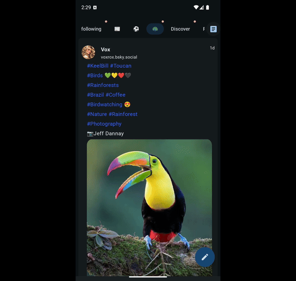
Bluesky allows for embedding arbitrary content in a post, from images, to videos, to just plain text. I'm very fond of birds, and I find that when in my bird feeds, the hashtags added to the post that enable it to be aggregated by my bird feed generator, invariably detract from the content. Therefore, it would be really useful if I could choose the way content in a feed is presented.
|
|---|
Hashtags taking layout space from content |

I want to have 3 presentation types:
Text with embedded content
Expanded media
Condensed media
sealed class Presentation(
   val key: String,
) {
   sealed class Text {
       data object WithEmbed : Presentation(
           key = "presentation-text-and-embed",
       )
   }

   sealed class Media {
       data object Expanded : Presentation(
           key = "presentation-expanded-media",
       )

       data object Condensed : Presentation(
           key = "presentation-condensed-media",
       )
   }
}
Each of these presentations show the same content types, although with different rules. The content types are:
private sealed class PostContent(val key: String) {
   data object Attribution : PostContent(key = "Attribution")
   data object Text : PostContent(key = "Text")
   sealed class Embed : PostContent(key = "Embed") {
       data object Link : Embed()
       data object Media : Embed()
   }


   data object Metadata : PostContent(key = "Metadata")
   data object Actions : PostContent(key = "Actions")
}
Composition permanence with different presentation types
Regardless of the presentation I want, all content is placed within a Column. However, since content is reordered depending on the presentation, I cannot rely on the implicit key the Compose runtime provides by virtue of being invoked in Composition to identify my composables. Instead, I must provide a key for each one that is stable across recompositions. To do this, I first define canonical orders for each presentation:
@Stable
private val Timeline.Presentation.contentOrder
   get() = when (this) {
       Timeline.Presentation.Text.WithEmbed -> TextAndEmbedOrder
       Timeline.Presentation.Media.Expanded -> ExpandedMediaOrder
       Timeline.Presentation.Media.Condensed -> CondensedMediaOrder
   }


private val TextAndEmbedOrder = listOf(
   PostContent.Attribution,
   PostContent.Text,
   PostContent.Embed.Media,
   PostContent.Metadata,
   PostContent.Actions,
)


private val ExpandedMediaOrder = listOf(
   PostContent.Attribution,
   PostContent.Embed.Media,
   PostContent.Actions,
   PostContent.Text,
   PostContent.Metadata,
)


private val CondensedMediaOrder = listOf(
   PostContent.Attribution,
   PostContent.Text,
   PostContent.Embed.Media,
   PostContent.Metadata,
   PostContent.Actions,
)
With the above defined, I now need to make sure the Compose runtime uses the same key for each content type:
@Composable
fun Post(
   panedSharedElementScope: PanedSharedElementScope,
   presentationLookaheadScope: LookaheadScope,
   modifier: Modifier = Modifier,
   post: Post,
   ...
   timeline: @Composable (BoxScope.() -> Unit) = {},
) {
   Box(modifier = modifier) {
       if (presentation == Timeline.Presentation.Text.WithEmbed) Box(
           modifier = Modifier
               .matchParentSize()
               .padding(horizontal = 8.dp),
           content = timeline,
       )
       val postData = rememberUpdatedPostData(...)
       val verticalPadding = when (presentation) {
           Timeline.Presentation.Text.WithEmbed -> 4.dp
           Timeline.Presentation.Media.Expanded -> 8.dp
           Timeline.Presentation.Media.Condensed -> 0.dp
       }
       Column(
           modifier = Modifier
               .padding(vertical = verticalPadding)
               .fillMaxWidth(),
           verticalArrangement = Arrangement.spacedBy(verticalPadding),
       ) {
           presentation.contentOrder.forEach { order ->
               key(order.key) {
                   when (order) {
                       PostContent.Actions -> ActionsContent(postData)
                       PostContent.Attribution -> AttributionContent(postData)
                       PostContent.Embed.Link -> EmbedContent(postData)
                       PostContent.Embed.Media -> EmbedContent(postData)
                       PostContent.Metadata -> if (isAnchoredInTimeline) MetadataContent(postData)
                       PostContent.Text -> TextContent(postData)
                   }
               }
           }
       }
   }
}
Each of the content Composables use Modifier.animateBounds() on their children to then animate their bounds smoothly depending on the desired presentation. For example, ActionsContent() looks like:
@Composable
private fun ActionsContent(
   data: PostData,
) {
   when (data.presentation) {
       Timeline.Presentation.Text.WithEmbed,
       Timeline.Presentation.Media.Expanded,
           -> PostInteractions(
           modifier = Modifier
               .contentPresentationPadding(
                   content = PostContent.Actions,
                   presentation = data.presentation,
               )
               .animateBounds(
                   lookaheadScope = data.presentationLookaheadScope,
                   boundsTransform = data.boundsTransform,
               ),
           replyCount = format(data.post.replyCount),
           …,
           onPostInteraction = data.postActions::onPostInteraction,
       )


       Timeline.Presentation.Media.Condensed -> Unit
   }
}
The end result is this animation for presentation changes:
|
|---|
Letting content shine with different presentation types |
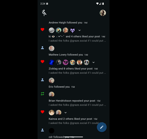
Aggregated Notifications
Social media notifications tend to come in bursts. Typically, multiple people perform an action on the most recent post you have. In the case of Heron, this can be likes, reposts or new followers. When Heron encounters consecutive notifications of the same type, it aggregates them into a single notification:
|
|---|
Aggregated notifications for a post |

Should you want more detail on the individuals that performed the action, the notification expands in place to show more details about their profiles.
Composition permanence with aggregated notifications
The parent layout of the notifications is changing from a Row to a Column, therefore, the most convenient way to maintain composition permanence, is to actually hold a reference to the Composition using movableContentOf or movableContentWithReceiverOf.
@Composable
fun NotificationAggregateScaffold(
   panedSharedElementScope: PanedSharedElementScope,
   modifier: Modifier = Modifier,
   isRead: Boolean,
   notification: Notification,
   profiles: List<Profile>,
   onProfileClicked: (Notification, Profile) -> Unit,
   icon: @Composable () -> Unit,
   content: @Composable () -> Unit,
) {
   Row(
       modifier = modifier,
       horizontalArrangement = Arrangement.spacedBy(16.dp),
   ) {
       icon()

       Column(verticalArrangement = Arrangement.spacedBy(8.dp)) {
           var isExpanded by rememberSaveable { mutableStateOf(false) }
           val renderedProfiles = remember(profiles) {
               when (profiles.size) {
                   in 0..6 -> profiles
                   else -> profiles.take(6)
               }
           }
           val expandButton = remember {
               movableContentWithReceiverOf<PanedSharedElementScope, Boolean> { expanded ->
                   ExpandButton(
                       isExpanded = expanded,
                       onExpansionToggled = { isExpanded = it }
                   )
               }
           }
           val items = remember {
               movableContentWithReceiverOf<
                       PanedSharedElementScope,
                       Boolean,
                       Notification,
                       List<Profile>,
                       >
               { isExpanded, notification, renderedProfiles ->
                   ExpandableProfiles(
                       isExpanded = isExpanded,
                       notification = notification,
                       renderedProfiles = renderedProfiles,
                       onProfileClicked = onProfileClicked,
                   )
               }
           }
           with(panedSharedElementScope) {
               if (isExpanded) Column(
                   modifier = Modifier
                       .fillMaxWidth()
                       .clickable { isExpanded = !isExpanded },
                   verticalArrangement = Arrangement.spacedBy(8.dp),
               ) {
                   if (renderedProfiles.size > 1) expandButton(isExpanded)
                   items(isExpanded, notification, renderedProfiles)
               }
               else Row(
                   modifier = Modifier
                       .fillMaxWidth()
                       .clickable { isExpanded = !isExpanded },
                   horizontalArrangement = Arrangement.spacedBy(8.dp)
               ) {
                   items(isExpanded, notification, renderedProfiles)
                   if (renderedProfiles.size > 1) expandButton(isExpanded)
               }
           }
           Box(
               modifier = Modifier.animateBounds(
                   lookaheadScope = panedSharedElementScope
               )
           ) {
               content()
           }
       }
   }
}
With Composition permanence guaranteed, next is actually animating each element in ExpandableProfiles:
@Composable
private fun PanedSharedElementScope.ExpandableProfiles(
   isExpanded: Boolean,
   notification: Notification,
   renderedProfiles: List<Profile>,
   onProfileClicked: (Notification, Profile) -> Unit,
) {
   renderedProfiles.forEach { profile ->
       Row(
           modifier = Modifier.animateBounds(
               lookaheadScope = this@ExpandableProfiles,
           ),
           verticalAlignment = Alignment.CenterVertically,
       ) {
           AsyncImage(
               modifier = Modifier
                   .size(32.dp),
               args = …
           )
           AnimatedVisibility(
               visible = isExpanded,
               exit = fadeOut(),
           ) {
               Text(
                   modifier = Modifier
                       // Fill max width is needed so the text measuring doesn't cause
                       // animation glitches. This is also why the link is used for clicking
                       // as opposed to the full text.
                       .fillMaxWidth()
                       .padding(horizontal = 8.dp),
                   text = remember {
                       buildAnnotatedString {
                           …
                       }
                   },
                   overflow = TextOverflow.Visible,
                   maxLines = 1,
               )
           }
       }
   }
}
|
|---|
Moving content with |
Large screen layouts and app panes
Building a large screen app with Jetpack Compose does not have to mean compromising on developer or user experience, and this is very well illustrated with this last example.
The basic unit for an app, is what is displayed on the device at any point in time; that is a navigation destination. This used to be an Activity on Android but in Compose large screen parlance, this is a "Pane". To build a large screen app at scale, it is necessary for an app to easily render multiple panes at once. Once an app can do this, the next step is achieving a pleasant UI/UX with those panes with each user interaction and app state change. If the app initially showed pane "A" and a state change caused both pane "A" and pane "B" to show, there should be an animation that meaningfully conveys this state change.
Composition permanence with large screen layouts and app panes
In the previous examples, permanence was achieved with a key, or with moving Composables with movableContentOf(). This example has the delightful distinction of needing both:
A navigation destination may be in the primary, secondary, or tertiary pane (if in a standard 3 pane layout), and it must use the same
keyregardless of which pane it is in.The navigation destination has state. It may have a
ViewModel, the user may have typed some text… whatever it is, that state has to follow the UI across each pane it is in.
For the former, I use a SplitLayout Composable, that allows me specify the key for the content rendered within the pane. For the latter, things get a little interesting as the navigation library of choice has to:
Allow concurrently for rendering multiple navigation destinations in different panes.
Support the concept of movable navigation destinations, their life cycles and their state.
These are currently novelties as far as navigation libraries go. To my knowledge, there are only two navigation libraries that do this (Other navigation libraries show one navigation destination at a time), and they're both experimental:
TreeNav: An experiment I started a few years ago to experiment with movable navigation destinations in Compose.
Jetpack Navigation 3: An experiment that defines the primitives needed for movable navigation destinations at scale, and Compose first APIs for managing navigation state.
TreeNav provides a MultiPaneDisplay following the Navigation 3 convention for naming a Composable that displays panes. Each navigation destination composable that shows in a pane is backed by movableContentOf. Combined with Navigation 3 and the SplitLayout Composable, Composition permanence for navigation destinations in arbitrary panes is achieved by:
Navigation 3 providing permanence with regards to business and UI logic architectural state with its
NavLocalProviderprimitives:SaveableStateNavLocalProviderforrememberSaveableto work across navigation panes.SavedStateNavLocalProviderforSavedStateRegistryOwnersemantics.ViewModelStoreNavLocalProviderfor preserving the sameViewModelinstance across panes.
MultiPaneDisplayprovides permanence with UI logic architectural state with the use ofmovableContentOfso usages ofremember { }and other values stored in composition are persisted across navigation panes.SplitLayoutuses akeyto make sure if the pane render order is changed, everything still works as expected. This is also for UI logic architectural state.
With all that heavy lifting done by library code, the app code only needs to call:
Scaffold(
   modifier = Modifier
       .animateBounds(
           lookaheadScope = panedSharedElementScope,
           boundsTransform = remember {
               scaffoldBoundsTransform(
                   appState = appState,
                   paneScaffoldState = paneScaffoldState,
               )
           }
       ),
   containerColor = containerColor,
   topBar = {
       …
   },
   floatingActionButton = {
       …
   },
   bottomBar = {
       …
   },
   content = { paddingValues ->
       paneScaffoldState.content(paddingValues)
   },
)
The result is as navigation destinations move from pane to pane in whatever order, state is preserved.
|
|---|
Compositional permanence across navigation destinations in different app panes |
Wrap up
In Jetpack Compose apps, preserving state with each composition is crucial to achieving visual continuity in apps. This visual continuity, also called "motional intelligence" is critical for building immersive, world class apps for all platforms.
Outside of use with Modifier.animatedBounds(), composition permanence when scoped to navigation state also allows for:
Moving arbitrary content across navigation destinations
"Live" previews of the navigation stack with the predictive back APIs.
|
|---|
Compositional permanence across navigation destinations used for back previews |
You can see the source code for all the animations shown above here:
Happy composing!
Loading comments...